I am taking a virtual quilting workshop that is basically a lot of fun, BUT, the instructor is relying on the traditional Red, Yellow and Blue color wheel for choosing the colors to use in our quilts.

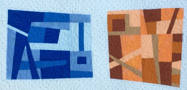
For example, I randomly chose Tetrad Blue. So, I made an improv quilt with two sets of complimentary colors: Blue/Orange and Red-Violet/Yellow-Green. The idea was to start with monochromatic blocks with different values of the colors and then mix them all together. The mixing proved too chaotic and I felt it was a non-harmonic clashing mess. So rather than merge it all together, I softened the look with negative space and came up with this:


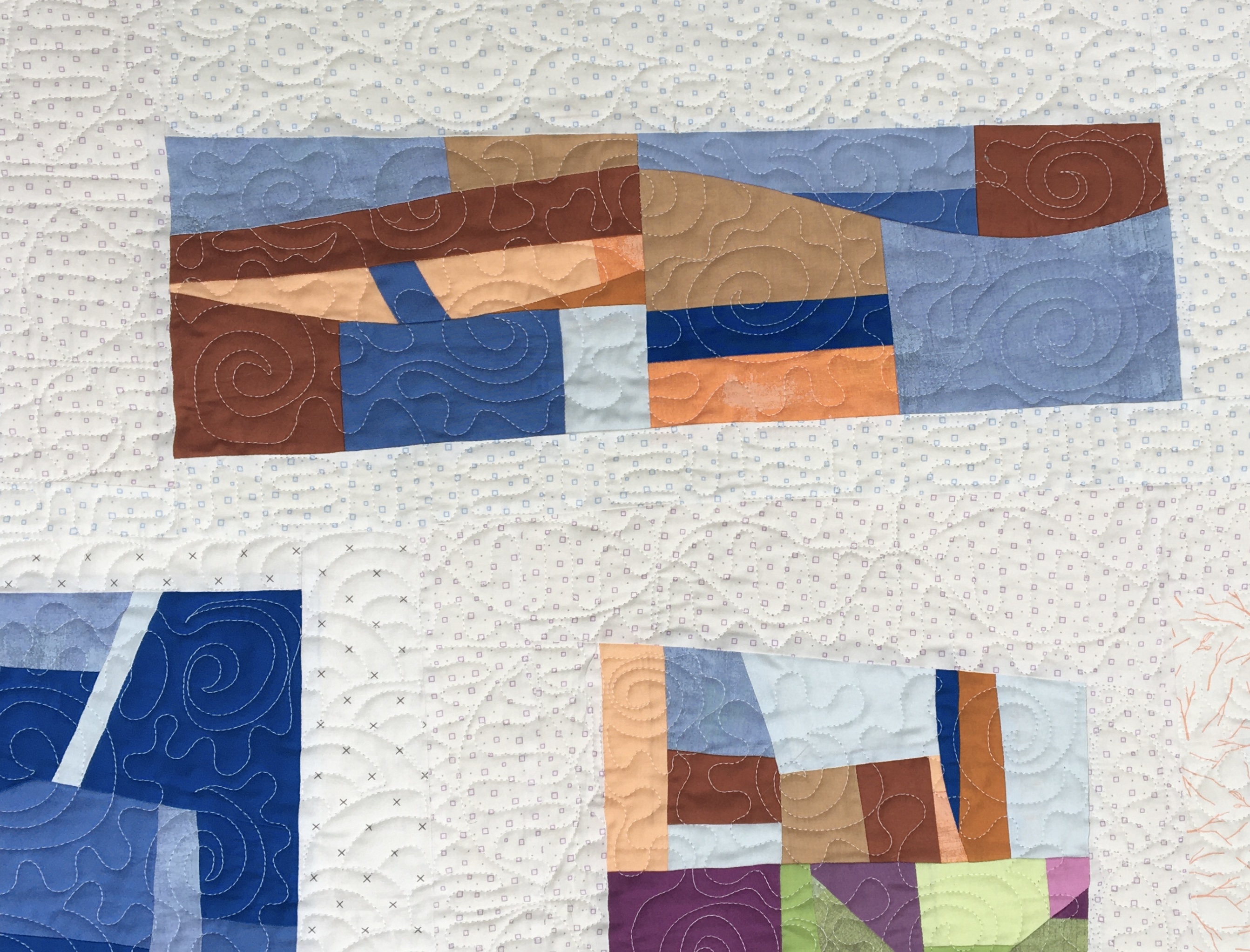
And I ended up liking it. Sometimes I even love it. It definitely looks better in person.
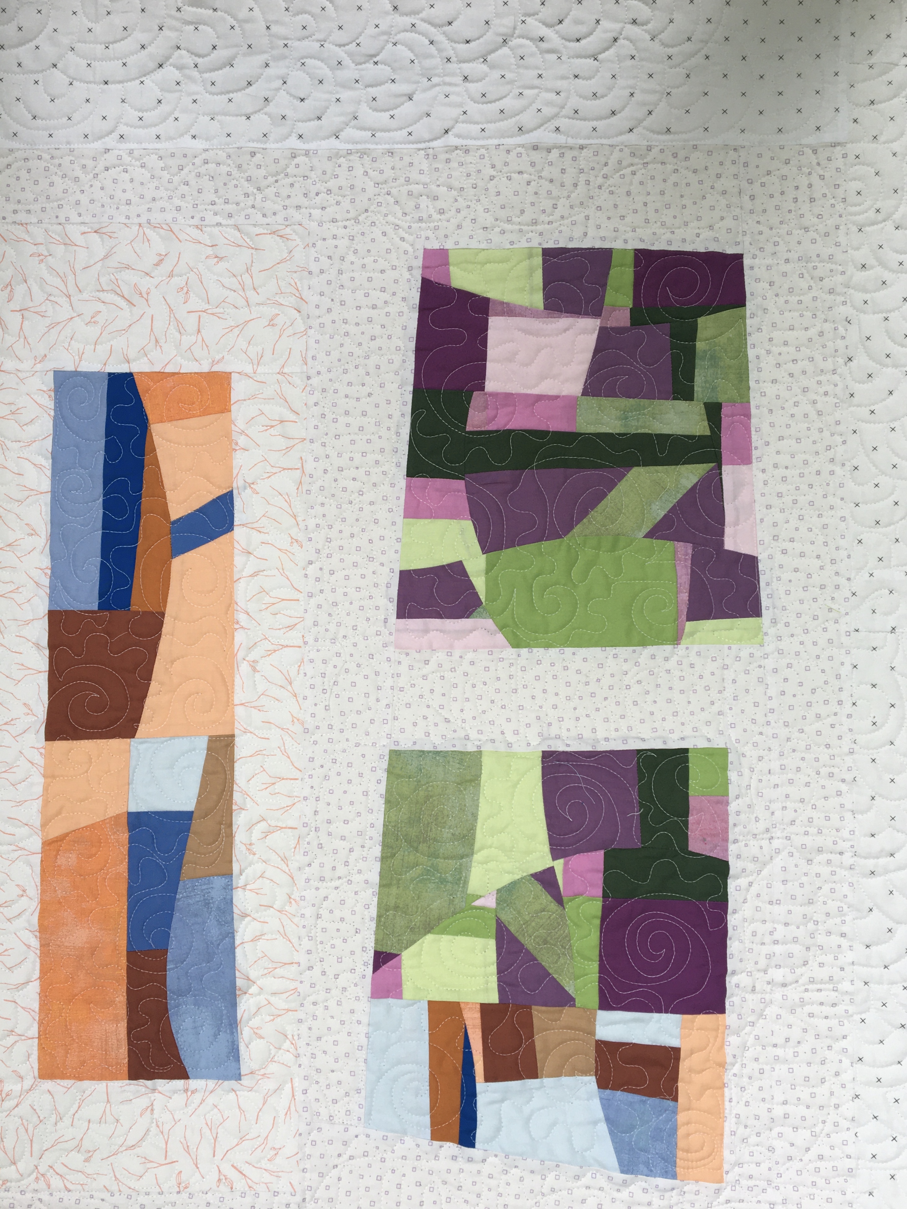
Next up was a small minimalistic quilt. I tried working with the color wheel but ultimately the blue fabric I picked seemed to look really interesting with the yellow and yellow green fabrics I pulled out of my stash. But, even though I thought it all looked okay together, I could not make it work on the color wheel. I pulled out my Ultimate 3-in-1 Color Tool by Joen Wolfrom and still could not justify the use of my colors. Regardless, I decided to use the colors:
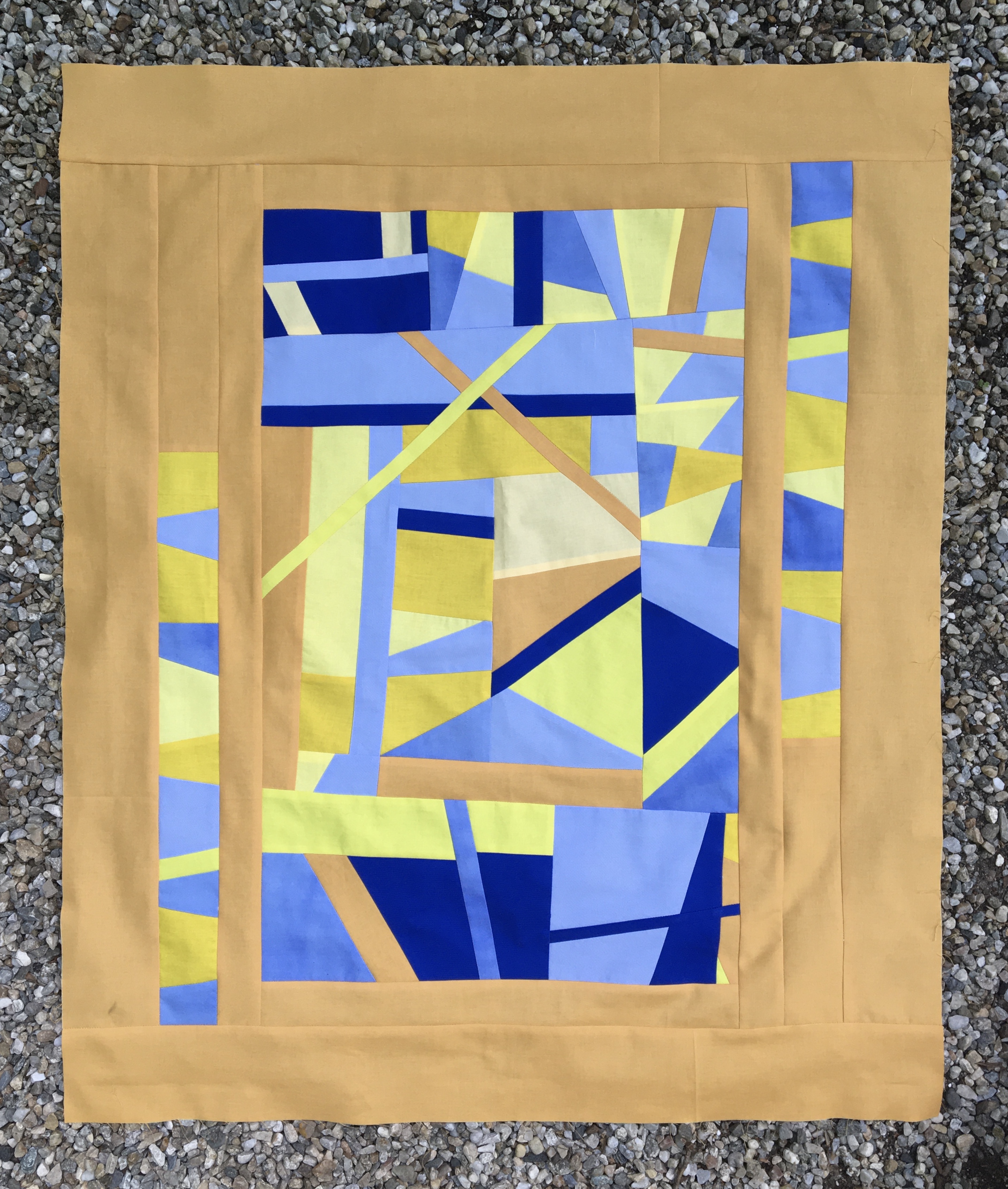
Maybe improv is not your thing, but I do think the colors work, and it was a fun time putting it together. And, yes, it went beyond minimalistic, but never mind about that!
So I began wondering about the use of the color wheel for quilting. Should I be relying on it to pick “complimentary” colors? Do orange and blue go together? Here is an article I came across: https://blog.asmartbear.com/color-wheels.html
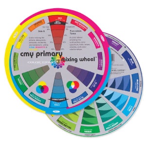
If you read through the article you will see alternative color wheels. Both the wheel based on light and the one based on the CMYK printing ink (process color) show yellow across from or complimenting blue, rather than orange. And, that is what I did in my second quilt.

If I had followed the traditional mixing color wheel I would have had a violet and yellow quilt.
There is a lot of discussion regarding the traditional color wheel and its shortcomings. Here is another article: https://www.handprint.com/HP/WCL/color13.html. I have not read through the entire discussion, but the point it this: the Wheel is controversial! My favorite quote from that article is this: “Experienced artists learn to use the color wheel as a compass to color improvisation“
I am looking at a CMY Mixing Color Wheel which I think makes more sense.
I also have another tool that my friend Peggy Anne recommended years ago, The Color Scheme Bible by Anna Starmer. She used this to put quilt kits together for her shop for years with great success. I did not find any schemes that featured Orange and Blue in Anna’s book.
